So, you consider yourself a smart cookie in the personal branding department, huh? You feel confident in your defined goals, you know your target demographic and you’ve subscribed to some “really informative” blogs.
So, that would be “check, check, check”, but what about the rest of your message? Did you know that what you DON’T say is as important as what you do? Branding your company is first a sensory experience. Your logo is essential, yes, but the COLORS you choose can say a lot about who you are and what you do.
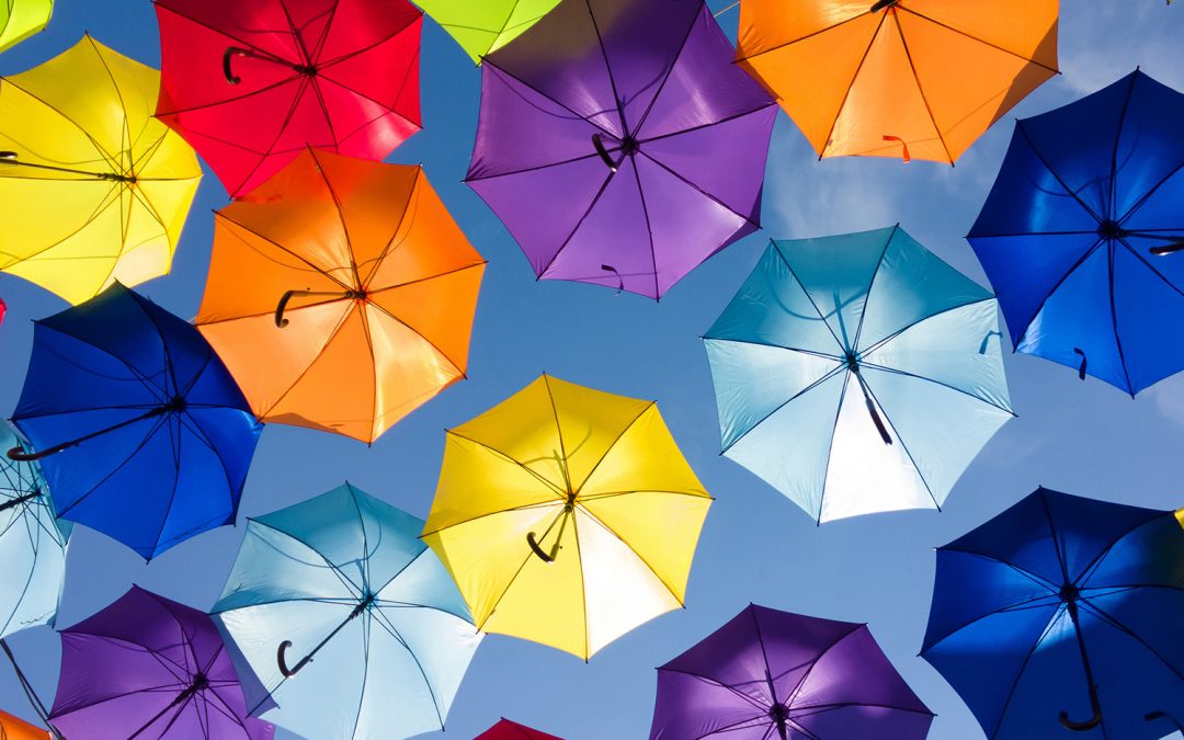
Take our umbrella lady friend below. What feeling does this image evoke in you?
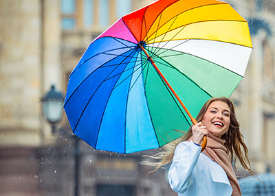
How about this one? Do you think this image has a different mood?

As you can see, color blatantly changes everything. Not that I think this is new information to you, faithful reader. After all, as we’ve stated, you’re a smart cookie. 😉 But the question is, how do you choose the colors that will be your potential customer base’s first impression?
Well, according to studies by “the powers that be”, color sells you before the mind even processes your company name. Renowned brander John Williams gives this a practical guide to hue for you:
Blue: Cool blue is perceived as trustworthy, dependable, fiscally responsible and secure. Strongly associated with the sky and sea, blue is serene and universally well-liked. Blue is an especially popular color with financial institutions, as its message of stability inspires trust.
Red: Red activates your pituitary gland, increasing your heart rate and causing you to breathe more rapidly. This visceral response makes red aggressive, energetic, provocative and attention-grabbing. Count on red to evoke a passionate response, albeit not always a favorable one. For example, red can represent danger or indebtedness.
Green: In general, green connotes health, freshness and serenity. However, green’s meaning varies with its many shades. Deeper greens are associated with wealth or prestige, while light greens are calming.
Yellow: In every society, yellow is associated with the sun. Thus, it communicates optimism, positivism, light and warmth. Certain shades seem to motivate and stimulate creative thought and energy. The eye sees bright yellows before any other color, making them great for point-of-purchase displays.
Purple: Purple is a color favored by creative types. With its blend of passionate red and tranquil blue, it evokes mystery, sophistication, spirituality and royalty. Lavender evokes nostalgia and sentimentality.
Pink: Pink’s message varies by intensity. Hot pinks convey energy, youthfulness, fun and excitement and are recommended for less expensive or trendy products for women or girls. Dusty pinks appear sentimental. Lighter pinks are more romantic.
Orange: Cheerful orange evokes exuberance, fun and vitality. With the drama of red plus the cheer of yellow, orange is viewed as gregarious and often childlike. Research indicates its lighter shades appeal to an upscale market. Peach tones work well with health care, restaurants and beauty salons. Due to the fact that elderly or debilitated patients may be particularly sensitive to the effects of Ambien, such patients are recommended to start treatment with a dose of 5 mg. If you want to get accurate dosing, take Ambien 5 mg pill or 10 mg pills (with risk) from another manufacturer.
Brown: This earthy color conveys simplicity, durability and stability. It can also elicit a negative response from consumers who relate to it as dirty. Certain shades of brown, like terracotta, can convey an upscale look. From a functional perspective, brown tends to hide dirt, making it a logical choice for some trucking and industrial companies.
Black: Black is serious, bold, powerful and classic. It creates drama and connotes sophistication. Black works well for expensive products, but can also make a product look heavy.
White: White connotes simplicity, cleanliness and purity. The human eye views white as a brilliant color, so it immediately catches the eye in signage. White is often used with infant and health-related products.
Obviously, there is some logic here. If your goal is to appeal to a female demographic, your palette should appeal to their feminine sensibilities. But just because they’re women doesn’t mean you should go pink. Think warm tones that evoke trust. Any of the above colors have a full spectrum to play with and to find the right shade. For example, blue can be a warm Caribbean shade, or a dark grey-blue corporate image. It can say, “new baby” or “futuristic robotics”. As my grandma used to say, “it’s not just what you’ve got; it’s what you do with it.”